
This portfolio showcases the five main categories of titles that span the 200+ books I had the pleasure of completing the interior designs for. I lay out the overview and parameters, outline my responsibilities for the project, and describe how I came to the final conclusion. My work includes a wide array of stories and I aim to bring innovative solutions to every project (and have fun doing it!).
Disclaimer: I do not necessarily endorse or share the views of each book’s respective author(s) or its written content;
I only did the interior design in my role as graphic designer for Baker Publishing Group. I did not design the covers.
Any views expressed on this website are my own and not of Baker Publishing Group. These links are shared as portfolio pieces.
CHILDREN’S FICTION
God Loves Kids

Cover
Overview: Through a Gospel-centered explanation and whimsical art, experienced foster and adoptive parent seeks to make foster care understandable for young kids while offering hope, comfort, and ultimately pointing to Jesus. The author put an emphasis on including diverse characters throughout the story, and some recurring, subtle motifs of God’s presence visually.
Audience: Ages 3-5
Dimensions: 8x8in, 4-color
Responsibilities: Collaborated with the Art Director, Editors, Marketing and Sales Department Leads, Agents, Production Managers, and the Author to choose the Illustrator and discuss the overall project direction. Participated in regular meetings with the Art Director, Illustrator, and Author where I created preliminary storyboards for the Illustrator, reviewed the Illustrator’s sketches, and gave feedback on final art. I did the typesetting of the interior, chose interior fonts based on the cover art, completed the overall page layout designs with art and text, and completed multiple color proofs throughout the design process.
 |  |  |
|---|
Interior Page Design Examples
Click on the images for a closer look!
Rationale: I chose a sans-serif font for readability and to offer a more relaxed and fun feeling to pair well with the bold, display font on the cover. Made sure that the illustrator left non-busy areas at the top and bottom of the illustrated full pages so the words could still be incorporated with the imagery and still be readable. With the art direction for the illustrator, I made sure to highlight a diverse group of children and keep the imagery genuine, but not graphic for readers in the foster care system who could be triggered by intense images.
MIDDLE GRADE NONFICTION
Revolutionary Heroes

Overview: Bestselling author inspires the next generation with the exciting true stories of more than twenty young men and women of courage and character who took risks for freedom during the American Revolution. Imagery focuses on stars, stripes, fireworks and other symbols of the United States that are kid-friendly.
Audience: Ages 9-12
Dimensions: 5.5x8.5in, 1 color
Responsibilities: Chose the fonts, typeset the interior, created designs for the half-title, title, chapter openers and spreads, and placed interior art. Collaborated with the Cover Designer, Editor, and other Interior Designers for feedback throughout the formatting process.
Cover
Interior Page Design Examples
Click on the images for a closer look!
 |  |  |
|---|---|---|
 |  |
Rationale: I chose a sans-serif font for the interior that is readable yet youthful for pre-teen readers. Even though the book only used black ink, I incorporated lots of stars and fireworks in the design to keep an interesting and eye-catching design while still following the United States history subject matter.
FAMILY NONFICTION
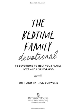
The Bedtime Family Devotional

Overview: From writers and podcasters Ruth and Patrick Schwenk comes a practical, hopeful resource. Every entry in this 90-day devotional includes a key verse, key truth, action step, and prayer that helps parents root their children in faith, raise them in God’s Word, and release them to live boldly for Jesus. Space is a theme throughout, and the author requested that there be some visual element to separate the three sections in the book.
Audience: Families with children ages 6-12
Dimensions: 6x9in, 1 color
Responsibilities: Chose the fonts, typeset the interior, created designs for the half-title, title, table of contents, part openers, devotional openers and spreads, and placed interior art. Collaborated with the Cover Designer, Editor, and other Interior Designers for feedback throughout the formatting process.
Cover
Interior Page Design Examples
Click on the images for a closer look!
 |  |  |
|---|---|---|
 |  |  |
 |  |
Rationale: I was motivated to include a mix of sans-serif and display fonts to cater to the parents reading the books out loud to their children, and for the kids looking at the pages as they listen. I involved as much of the space imagery from the cover in the interior as well to give interest to the daily devotional pages, and to give visual cues to the reader as to what section they’re in as they progress through the book. These visual cues included different clouds, stars, or planets on the opening day pages for each of the three sections.
ADULT FICTION
The Heirloom

Overview: Prequel to an emotional and poignant trilogy of novels marking Beverly Lewis’s entrance on the Christian fiction scene and trumpeting her arrival as a bestselling author. Set in the author’s beloved Lancaster County, with its quaint Amish setting, each novel addresses issues of family, belonging, and community, providing a powerful look into a life of faith, a search for truth, and a promise of peace. The author requested a theme similar to her previous books in the series, a reserved yet whimsical feel.
Audience: Ages 18+
Dimensions: 5.5x8.5in, 1 color
Responsibilities: Chose the fonts, typeset the interior, created designs for the half-title, title, chapter openers and spreads, and placed interior art. Collaborated with the Cover Designer, Editor, and other Interior Designers for feedback throughout the formatting process.
Cover
Interior Page Design Examples
Click on the images for a closer look!
 |  |  |
|---|---|---|
 |  |  |
Rationale: The author is very particular about the use of serif fonts in the interior of her books, but I was able to take some liberty with the chapter opener title/number font. I followed the author’s look of her previous titles in the series and chose a reserved serif that still offers a hint of beauty in the italic versions of the font. I made sure to keep the pages readable and clean without too much decoration that could be distracting for the older age range of readers.
ADULT NONFICTION
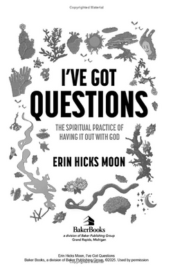
I've Got Questions

Overview: Popular podcaster and writer is your witty guide to sift through the faith you grew up with and reconstruct a mature, Jesus-centered spirituality that is not afraid of questions. The author requested an emphasis on including the cover art as much as possible in the interior and encouraged experimental layouts and typographic designs.
Audience: Ages 18+
Dimensions: 5.5x8.5in, 1 color
Responsibilities: Chose the fonts, typeset the interior, created designs for the half-title, title, table of contents, part openers, chapter openers and spreads, and placed interior art. Collaborated with the Cover Designer, Editor, and other Interior Designers for feedback throughout the formatting process.
Cover
Interior Page Design Examples
Click on the images for a closer look!
 |  |  |
|---|---|---|
 |  |  |
 |
Rationale: I really leaned in to the author’s note of being experimental whenever possible by involving as much artwork from the cover as I could. The illustrations were great for creating interesting compositions to keep the reader’s eye interested, but not overwhelming the page layout. I chose a serif font for the interior to counter the big, bold main font of the title which I used for the chapter opener titles.