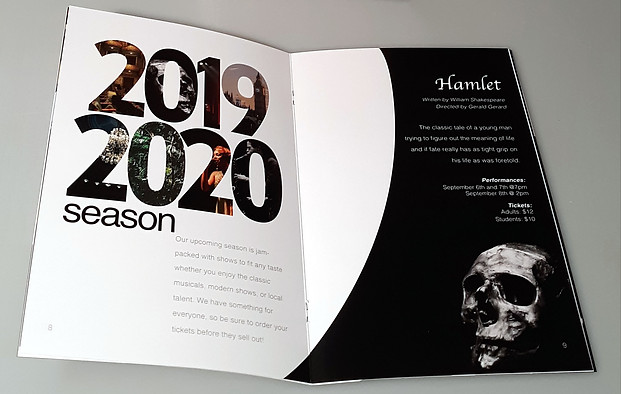
Ionia Community Theatre 2019/2020 Season Booklet

Concept
Created an updated logo and booklet to outline the community theatre’s upcoming season at the time to show what the community theatre does, their history, and ways to become involved with the theatre supported by information concerning the theatre’s upcoming show season. The booklet was produced with a modern look at the forefront to highlight the theatre is under the direction of a new president on their board of directors.
Description
Printed booklet at 6” x 9” size
Discipline
Typography/Publication
Date
2019
Software
InDesign, Illustrator
Publication Rationale
The audience for this booklet is aimed at those most likely to attend Ionia Community Theatre events and shows, and be interested in learning more about the history of the organization with the organization's upcoming show season. I deduced that this age range would include those ranging from 30-50 but would not necessarily exclude a younger or older audience than this range entirely.
I wanted a lot of dramatic and theatrical contrast between the colors in my palette. These colors were mainly influenced by the photos I chose to include in the piece. This palette included lots of darks and lights on both ends of the spectrum to increase that sense of contrast as much as possible.
I chose Tempo as a main font for headings and titles since it is the same font as the one used in the group's logo. It is very effective at bringing attention to the various places of the booklet that required it. I chose Helvetica Light as a nice sans-serif for the body copy of the composition to create hierarchy while still implementing an open feel overall to the piece without being too formal.
I wanted the feel of the composition to be informal and fun while simultaneously attention-grabbing and attention-keeping. Hierarchy was a main design element that I accomplished through size and scale of font and placement of images.